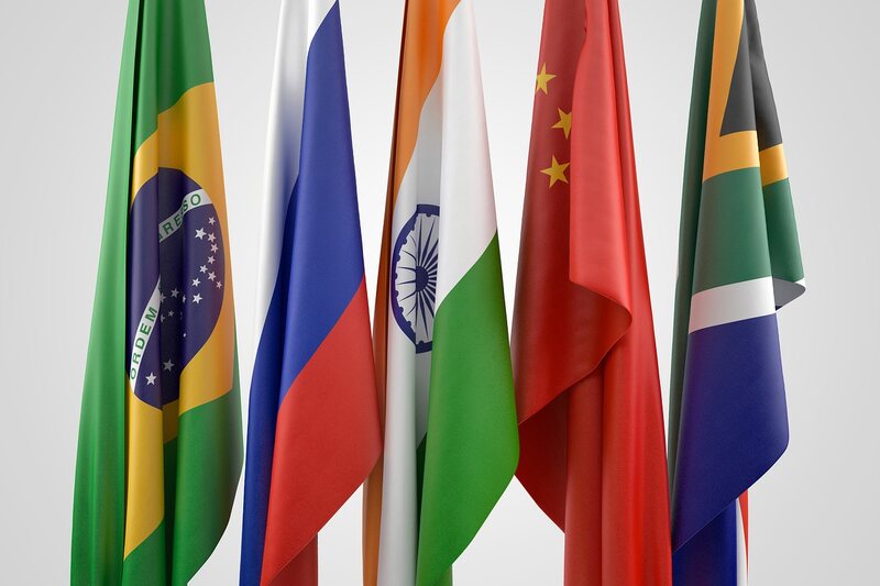
BRICS Unveils New Logo Featuring Lotus and Namaste
BRICS has also made a major symbolic step by introducing its new logo, with a lotus, a gesture of namaste in the center of it. The new logo represents oneness, harmony, and the common cultural values of the countries that are members, which is a significant step in the development of the global image of the bloc. The lotus is a symbol of strength, development, and harmony, whereas namaste is the symbol of respect and communication with other people – the foundational values of BRICS collaboration.
The new visual image is also being perceived to be more than a design revamp; it is an indication that BRICS is trying to portray a culturally grounded and at the same time progressive image in the global arena. Observers find that the logo collaborates with the inclusivity, multipolar cooperation and collective progress as the core of the group. The new logo is likely to provide greater recognition and support in its common values in case BRICS continues to increase its sway in the global economic and diplomatic arena.